|
Split Complementary Colors are "one off" from the opposite color. Pick a color, find it's complementary color, then select the two colors on either side of the complementary color. Split Complementary color schemes can use two or three colors. 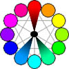
In this design, both buttons have problems. The Red on Blue places the complementary color (Red) on a split complementary background (blue). The Previous Button, however, has a different problem. There is not enough contrast between the Blue and Green to make the text easy to read. Solutions to this problem include using neutrals or a much lighter shade of green or blue for text on the blue background. Strengths: One of the most popular color schemes for expressive color effects. The split complementary color scheme adds analogous colors (shown in next example) to one side of a complementary color pair. Weaknesses: You can not use the "complementary" (opposite) color on either of the other two colors as it will "vibrate" (notice the Next Button on the right). This design uses the following colors:
(Continued on next page) |